
You update your service pages, refine your content, and drive traffic to your site, yet visitors still leave within seconds because they can’t find what they came for. A pricing page buried three clicks deep, a menu label that doesn’t match what someone is searching for, or a dead-end page with nowhere obvious to go next: these small navigation missteps quietly push people away before they ever engage with your business. Website navigation is more than a design feature; it gives structure to how a site is organised, guiding visitors toward what they need while helping search engines interpret and index pages accurately. As websites grow, maintaining this structure becomes essential for both usability and search visibility. In this guide, we’ll look at practical ways to create SEO-friendly navigation.
Navigation Essentials: A Quick SnapshotClear, well-structured navigation shapes how easily visitors find information and how effectively search engines crawl a site. Logical categories, descriptive labels, and consistent menus reduce friction for users while strengthening internal linking for discoverability. Mobile usability and accessibility ensure the experience works across devices and abilities. Common pitfalls like overloaded menus, vague links, and dead ends quietly undermine both usability and rankings. Thoughtful structure ultimately keeps visitors engaged and helps search engines index a site’s most important pages accurately. |
What Is SEO-Friendly Website Navigation?
SEO-friendly website navigation goes beyond a menu at the top of a page. It’s the underlying system that organises content into a logical hierarchy, using descriptive links and predictable groupings so both visitors and search engines can understand how a site fits together and move through it with minimal effort.
How Navigation Supports Website Crawling and Discovery
Internal links act as the routes search engines follow to find pages and gauge their significance within a site. Google’s own SEO documentation recommends organizing a site logically so that both search engines and users can understand how pages relate to the rest of the site. A well-organised hierarchy signals which content is central to the business and which is peripheral, helping search engines index the right pages with the right priority.
Why Navigation Matters to Visitors
For visitors, navigation is the difference between finding an answer in seconds and giving up. Confusing menus or unclear labels erode trust quickly; people often judge a business’s credibility by how easily they can locate services, pricing, or contact details.
How to Structure Website Navigation for Users and Search Engines
A well-structured navigation system helps visitors find relevant information quickly while giving search engines a clear map of how pages relate. The goal is a site that feels organised and intuitive rather than something visitors have to decode.
Organise Pages Into Logical Categories
Group related services, products, resources, or information under intuitive categories that reflect how visitors naturally search for them. Avoid placing unrelated pages under broad menu headings simply to reduce the number of options. A clear hierarchy helps users identify where they need to go without second-guessing a category’s contents.
Keep Navigation Labels Clear and Descriptive
- Use clear, familiar labels such as “Services,” “Products,” and “Contact.”
- Avoid vague terms like “Explore” or “Learn More.”
- Make each label clearly describe its destination so visitors don’t have to click just to find out what’s behind it.
Create a Consistent Navigation System
Keep primary navigation consistent across relevant pages so visitors do not have to relearn the website’s layout as they browse. Maintain the same menu behaviour and placement across desktop and mobile, so key sections stay in familiar spots wherever someone lands.
| Not sure if your navigation is helping or hurting conversions? Let’s take a closer look together and map out a clearer path. |
Website Navigation Best Practices That Improve Usability
- Use a clear navigation hierarchy: Use primary and secondary navigation, dropdowns, or breadcrumbs where they help visitors move between related sections without creating unnecessary complexity.
- Make important pages easy to reach: Give top service, product, and contact pages direct, one-click access from the main menu, since these are what most visitors are actively looking for.
- Add useful internal links: Include contextual links within page content to guide visitors toward related services, products, or resources as they read, rather than relying on the menu alone.
Mobile Navigation and Accessibility Considerations
Mobile navigation and accessibility help ensure visitors can use your website easily across different devices, abilities, and browsing methods.
Make Menus Practical on Smaller Screens
Mobile navigation should use readable labels, appropriately sized touch targets, and menus that are easy to open and close. Avoid requiring excessive scrolling or precise tapping to reach important pages, particularly on smaller screens.
Make Navigation Accessible
Accessible navigation should support keyboard users with a logical tab order and clearly visible focus states. Guidance from WebAIM recommends that every interactive element on a page be reachable and usable without a mouse, with a visible focus indicator at each step. Use meaningful link text that explains each destination rather than generic phrases like “click here.”
Common Website Navigation Mistakes to Avoid
A few navigation issues can make a website harder to use and undercut the structure you’ve built.
- Overloading the Main Menu: Cramming every page into the primary navigation makes the menu difficult to scan and forces visitors to sift through options that don’t apply to them.
- Using Vague or Duplicate Links: Multiple links pointing to different pages under the same label, or several links leading to the same destination, make the site feel disorganised and unpredictable to navigate.
- Creating Dead Ends: Pages without useful onward links can leave visitors unsure where to go next and give search engines fewer opportunities to discover related content.
5 Checks for Better Website Navigation
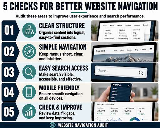
A well-structured website makes it easier for visitors to find information and take action. This infographic highlights five essential navigation checks: clear content structure, simple menus, accessible search, mobile-friendly navigation, and ongoing performance improvements. Reviewing these areas can reduce friction, improve usability, support stronger engagement, and create a smoother experience across devices. Regular navigation audits also help identify gaps before they negatively affect visitors or search performance.
Where Structure Meets Strategy
Navigation decisions affect more than convenience; they influence rankings, engagement, and how long visitors stay before leaving. Think Shaw works with businesses on website design, on-page SEO, and content strategy to make sure every part of a site, from menus to internal links, actually supports growth instead of working against it.
| Most sites don’t need a redesign; they need a second look at what’s quietly costing them visitors. |
Frequently Asked Questions About Website Navigation
How many items should be in a main navigation menu?
Most usability guidelines suggest 5–7 top-level items. Beyond that, visitors struggle to scan choices, and menus start feeling cluttered rather than helpful.
Do breadcrumbs actually help SEO?
Yes. Breadcrumbs create additional internal links and can appear in search results, helping users and search engines understand a page’s position within the site’s structure.
How deep should important pages be in the site structure?
Ideally, key pages should be reachable within three clicks from the homepage. Deeper pages tend to get crawled less frequently and receive less user traffic.
What is a flat site architecture?
A flat architecture keeps most pages just a few clicks from the homepage, reducing depth. It’s often favoured for smaller sites where content doesn’t require deep hierarchies.
What role does the footer play in site navigation?
Footers often house secondary links, such as policies or resources, giving both users and search engines additional pathways to pages not featured in the main menu.