As smartphones remain a primary gateway to online information, designing websites around mobile users has become a fundamental part of modern SEO. Mobile-first web design prioritizes how content, navigation, performance, and interactions function on smaller screens before expanding the experience for larger devices. This approach is especially relevant in 2026, when search visibility depends on more than keywords alone. Google continues to evaluate technical accessibility, page experience, and the quality of content it can crawl and understand across devices.
For businesses competing in search results, understanding the connection between mobile design and SEO is therefore essential. In this article, we examine the key technical and design factors that shape this relationship and explain why adopting a mobile-first approach matters for SEO performance in 2026.
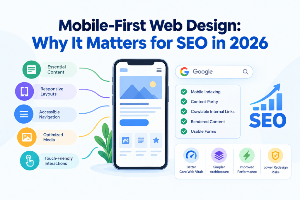
Mobile-First Web Design for SEO OverviewMobile-first web design prioritizes essential content, responsive layouts, accessible navigation, optimized media, and touch-friendly interactions for smaller screens. Because Google primarily indexes mobile versions, content parity, crawlable internal links, rendered content, and usable forms are essential for SEO. Mobile-first development also supports Core Web Vitals, simplifies responsive architecture, improves performance, and reduces SEO risks during redesigns by preserving important content, links, URLs, and search signals. |
What Is Mobile-First Web Design?
Mobile-first web design is an approach in which a website is designed and developed for smaller screens first and then enhanced for tablets and desktops. Rather than creating a complete desktop layout and scaling it down for mobile devices, developers first determine which content, features, and interactions are most important for users navigating on smaller screens. This approach also has direct SEO relevance because Google primarily uses the mobile version of a website’s content for indexing and ranking under mobile-first indexing. Therefore, mobile-first design is not simply about making a website fit a phone screen; it focuses on creating a complete, accessible, and technically sound mobile experience.
A mobile-first website typically involves:
- Prioritizing essential content
- Designing for touch
- Simplifying navigation
- Controlling media and scripts
- Using responsive layouts
- Maintaining content consistency
Which Mobile Design Elements Influence SEO Performance?
Mobile Content Parity
The mobile version should include the same primary text, headings, internal links, images, and important structured content as the desktop version. When significant content is removed from mobile, Google may have less information to work with when it crawls and indexes the page, which can affect how fully the page is understood.
Internal Links in Mobile Navigation
Mobile menus can sometimes hide important internal links behind several interaction steps. Key category, service, product, or informational pages should remain easily crawlable through standard HTML links instead of depending entirely on JavaScript-triggered interactions that may make those connections less accessible.
Responsive Image Implementation
Images should adjust to mobile screen dimensions without unnecessarily loading large desktop-sized files. Techniques such as `srcset` and `sizes` allow the browser to choose a more appropriate image resource for the user’s device, helping reduce unnecessary downloads while maintaining suitable image quality.
Intrusive Mobile Interstitials
Full-screen pop-ups that cover the main content as soon as a user arrives from search can make a mobile page difficult to use. Google identifies intrusive interstitials as a page-experience concern when these elements prevent users from easily accessing the content they came to view.
JavaScript-Dependent Content
When essential mobile content only appears after JavaScript runs or after a user interacts with the page, it can create rendering and accessibility complications. Important SEO content should be available in the rendered page rather than being unnecessarily dependent on client-side interactions before users or search engines can access it.
Tap Target Placement
Links, buttons, and other controls that are placed too close together can lead to accidental taps, particularly within mobile navigation, forms, filters, and other interactive areas. While tap-target size itself is not a direct ranking factor, poor placement can make the mobile experience frustrating and difficult to navigate.
Mobile Form Design
Long or complicated forms can create unnecessary friction when users are completing them on smaller screens. Appropriate input types, clear labels, logical field ordering, and fewer unnecessary fields make forms easier to complete and reduce the interaction barriers users may encounter on mobile pages.
| Your website’s mobile experience deserves careful technical implementation, which Think Shaw’s team handles with responsive layouts, mobile navigation, optimized resources, and SEO-ready development. |
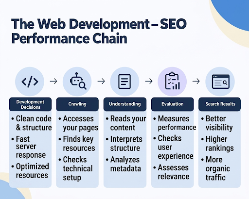
How Mobile-First Design Supports Search and User Experience (Infographic)
Mobile-first design creates a stronger connection between technical website decisions and everyday user behavior on smaller screens. The infographic below shows how each improvement builds on the previous one, creating a more effective mobile experience that supports long-term search performance.
Why Mobile-First Web Design Adaptation is Necessary to Support SEO in 2026
- Keeps the indexed version complete: Google primarily uses the mobile version of a website for indexing, so mobile adaptation must preserve the content and page elements that matter for search visibility.
- Protects internal page discovery: On mobile, simplified navigation can accidentally remove links to deeper pages. Therefore, it helps prevent important links from helping Google discover those pages, particularly across larger sites.
- Makes technical SEO easier to maintain: A single responsive URL structure reduces the complications associated with separate mobile URLs, duplicate versions, redirects, and device-specific implementations.
- Supports mobile-first crawling: Googlebot can encounter a mobile layout that behaves differently from its desktop counterpart. But building the mobile experience helps the version being crawled, so that it represents the actual page rather than a reduced or incomplete variation.
- Make mobile performance part of the development process: Designing for smaller devices from the beginning forces teams to consider resource-heavy scripts, images, fonts, and third-party elements before they become performance problems. This is particularly relevant to Core Web Vitals, which assess loading, responsiveness, and visual stability.
- Reduces the risk of SEO problems during redesigns: A mobile-first redesign can change navigation, URLs, content placement, and technical elements simultaneously. Planning the mobile experience as part of the site’s architecture makes it easier to preserve existing search signals during development.
Conclusion
A mobile-first website needs a development strategy that keeps usability and SEO working together. And to ease this process, Think Shaw offers responsive website design alongside SEO services, helping businesses build and optimize websites for modern search requirements. From adapting layouts for mobile screens to aligning website design with SEO requirements, our team can help build a stronger technical foundation for search visibility.
| Experience the difference a mobile-first website can make, and strengthen your SEO with Think Shaw. Get responsive web development tailored for modern search performance. |
Frequently Asked Questions About Mobile-First Web Design For SEO
Does mobile-first web design improve Core Web Vitals?
Yes. Mobile-first development encourages lighter layouts, optimized assets, and efficient code that help improve loading, responsiveness, and visual stability metrics.
Should mobile pages use structured data differently than desktop pages?
No. Mobile pages should include the same relevant structured data to help search engines interpret content consistently across devices.
Should businesses test mobile pages on multiple screen sizes?
Yes, testing different screen sizes helps identify layout, spacing, and interaction issues before they affect real mobile users.
Can mobile-first design help reduce bounce rates?
A smoother mobile experience encourages visitors to stay longer, explore more pages, and interact with website content more comfortably.
How often should a mobile-first website be audited for SEO?
Review mobile SEO every few months and after major updates to catch usability, performance, or indexing issues before they grow.