Mobile-first design has become essential for businesses that want to improve both search visibility and user conversions. Google now primarily uses the mobile version of a website for indexing and ranking, meaning poor mobile usability, missing content, or a weak page experience can limit SEO performance. Google also states that Core Web Vitals are used by its ranking systems, making speed, responsiveness, and visual stability important considerations. A mobile-first approach helps businesses create faster, easier-to-navigate experiences with clear calls to action, which can reduce friction and encourage visitors to take the next step. Below, we explore how mobile-first design influences SEO rankings and user conversion rates.
A Quick Overview of Mobile-First DesignMobile-first design strengthens SEO and conversion potential by prioritising smartphone usability, accessible content, responsive layouts, fast performance, and clear user journeys. Because Google primarily evaluates mobile content for indexing and ranking, businesses should maintain content consistency and monitor mobile performance. Optimising high-intent pages, reducing conversion barriers, testing user journeys, and using mobile data for continuous improvements can support stronger search visibility, engagement, and business growth. |
What Is Mobile-First Design
Mobile-first design is a web design approach that starts by creating the website experience for smartphones before adapting it for tablets and desktops. It prioritises essential content, simple navigation, fast loading, readable text, and easy-to-use calls to action. This approach is increasingly important because Pew Research Center reports that 90% of U.S. adults owned a smartphone in 2023, while 15% were smartphone-dependent internet users. This highlights the need for websites to provide complete and accessible mobile experiences. Google also primarily uses the mobile version of website content for indexing and ranking, making mobile-first design important for SEO.
How Mobile-First Design Affects SEO Rankings
Mobile-first design can influence search performance in several important ways, including the following:
- Supports Mobile-First Indexing: Google uses the mobile version of a website’s content for indexing and ranking. A mobile-first design helps ensure that important content is accessible, crawlable, and properly presented to search engines.
- Improves Mobile Page Experience: Mobile-first design prioritises readable text, responsive layouts, easy navigation, and properly sized interactive elements, helping create a smoother experience for mobile users and supporting mobile search visibility.
- Helps Maintain Content Consistency: Google recommends keeping primary content, headings, metadata, and structured data consistent between mobile and desktop versions. A mobile-first approach reduces the risk of important SEO elements being missing from the mobile site.
- Encourages Faster, More Efficient Pages: Designing for smaller screens often requires businesses to prioritise essential content and optimise page resources. Faster loading can improve user experience, while speed and page experience remain important considerations for search performance.
- Strengthens Mobile Search Competitiveness: Google has long considered mobile usability when evaluating search results. A website that works effectively on smartphones is better positioned to meet mobile user expectations and compete for visibility when users search from mobile devices.
| Experience the benefits of mobile-first website design with strategies that improve search visibility, usability, and conversion opportunities. |
How Mobile-First Design Affects User Conversion
Mobile-first design reduces friction, simplifies user journeys, and makes important actions easier to complete on smaller screens. The following factors show how mobile-first design affects user conversion:
Creates Faster Mobile Experiences
Mobile-first design encourages businesses to prioritise performance and essential page elements. Faster-loading pages can reduce frustration and help users access information without unnecessary delays. Google’s research has also linked improved mobile speed with higher conversion potential, reinforcing the importance of performance for business outcomes.
Makes Navigation Easier
Clear menus, logical page structures, and touch-friendly elements help users find what they need with less effort. On smaller screens, complicated navigation can quickly create friction. A mobile-first approach simplifies the browsing experience, making it easier for visitors to move towards a product, service, or conversion action.
Improves Call-to-Action Visibility
Mobile-first design gives greater importance to essential actions by keeping calls to action clear, accessible, and easy to tap. Whether the goal is requesting a quote, booking a service, making a purchase, or completing a form, prominent CTAs can help guide users through the conversion journey without confusion.
Reduces Friction in Forms and Checkouts
Long forms and difficult input fields can discourage mobile users from completing an action. Mobile-first design focuses on streamlined forms, appropriately sized fields, and simpler interactions, helping reduce the effort required to submit information or complete a transaction.
Builds a Smoother and More Trustworthy Experience
A smooth mobile experience should make information easy to access, interactions simple, and important actions straightforward. According to USAGov’s Designing with Empathy, its team used a mobile-first approach after research showed that most users would access its benefit finder on mobile devices. By designing for mobile needs first, the team simplified the experience and focused on essential information before adapting it for larger screens. This approach can reduce friction and help users navigate and complete actions with greater confidence.
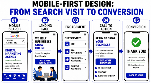
The Mobile User Journey: From Search to Conversion
A mobile user’s journey does not end when they find a website in search results. The experience that follows can determine whether they stay, explore, and take action or leave the page. Mobile-first design connects search visibility with conversion by creating a seamless path from the initial visit to meaningful engagement. From fast-loading pages and clear content to intuitive navigation and prominent calls to action, every element can reduce friction and help users move confidently from discovering a business to completing a desired action.
How to Optimize Your Site for Mobile-First SEO and Conversion Rates
Practical mobile-first improvements can strengthen search visibility and create smoother user journeys that support higher conversions. The following strategies can help:
Audit and Improve Mobile Performance
Regularly review key pages on smartphones to identify issues such as broken elements, difficult interactions, hidden content, or intrusive pop-ups that may affect search visibility and conversions.
Streamline High-Intent User Journeys
Focus on important pages and actions, such as service enquiries, product purchases, and contact forms. Remove unnecessary steps and test the complete mobile journey to make conversions easier.
Use Mobile Data to Test and Refine
Analyse mobile user behaviour to identify drop-off points and conversion barriers. Use these insights to test improvements and continuously refine your website’s mobile experience.
Conclusion
Mobile-first design plays an important role in improving SEO rankings and creating smoother experiences that encourage users to convert. By prioritising mobile usability, speed, accessibility, and clear user journeys, businesses can better support search performance and conversion goals. At Think Shaw, we help businesses implement effective mobile-first website strategies that align user needs, search visibility, and long-term digital growth.
| Support your website’s growth with mobile-first design strategies built to improve user experience, strengthen SEO performance, and increase conversions. |
FAQs About Mobile-First Design, SEO Rankings, and User Conversion Rates
Does mobile-first design mean creating a separate mobile website?
No. Most businesses use responsive design, where one website automatically adapts to different screen sizes instead of maintaining separate mobile and desktop websites.
Can a mobile-first redesign affect my existing SEO rankings?
Yes. Poorly managed redesigns can cause temporary ranking changes. Preserve important URLs, content, redirects, metadata, and technical SEO elements during the migration.
How can I check whether Google sees my website as mobile-friendly?
Use Google Search Console and PageSpeed Insights to review mobile usability, performance issues, and how Google evaluates your website’s mobile experience.
Should mobile and desktop websites have the same conversion goals?
Usually, yes, but the conversion path may differ. Mobile users may prefer calling, messaging, booking, or saving information rather than completing lengthy processes.
How often should I review my website’s mobile performance?
Review key mobile pages regularly, especially after redesigns, major updates, plugin changes, or significant traffic shifts that could introduce performance or usability problems.